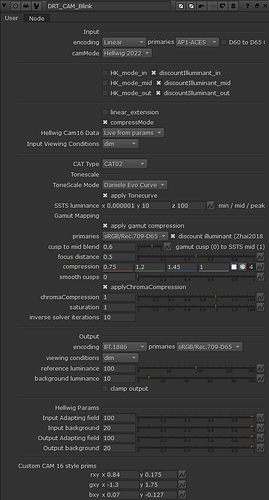
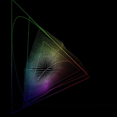
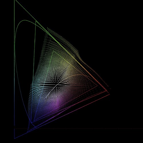
LUT repo has been updated to reflect the work done on v028
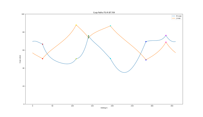
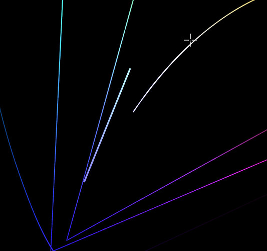
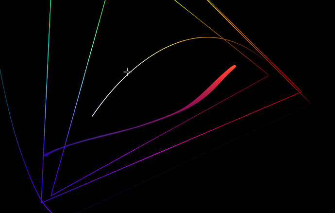
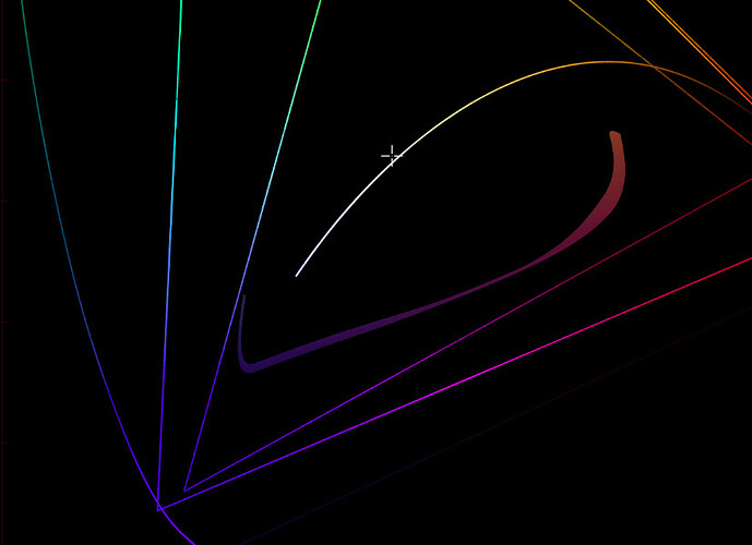
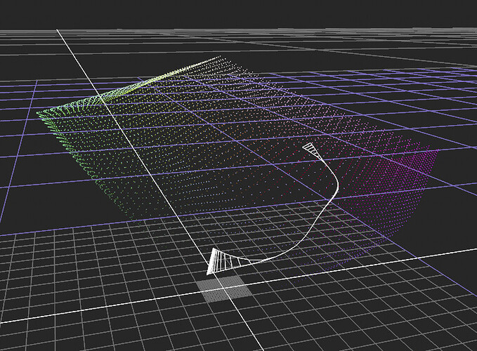
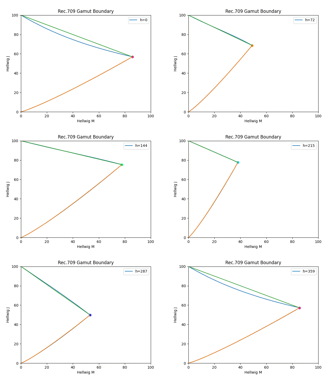
I now have a plot of the cusp path with the modified LMS matrix from v28.
Still broadly the same shape. And when I plot it for P3-D65, the shape is similar too.
I wonder what a gamut mapper would look like which was based simply on the path of the cusp, with straight lines to black and white? The data from my plot could simply be declared as two 360 entry arrays in the code, removing the need for an iterative solve.
In the last meeting the eccentricity factor in Hellwig came up and @luke.hellwig thought that it doesn’t affect things that much with the gamut mapper. So I quickly tested the model without it (set to 1.0) and indeed the effect is minimal. A small adjustment to the chroma compression made images pretty much exact match to the model with the factor. Biggest impact is in yellow/blue axis. Highly saturated blue gets a little lighter. Yellow compression is reduced giving more saturated yellow and orange, which I thought is good (and helps with inverse too).
So I’m thinking that the eccentricity factor could be removed from the model to simplify it, and to improve the inverse. And then as necessary change the hue-dependent chroma compression to adjust things. I could show example images, but there’s really nothing between the images with and without it, the effect is so small.
Using version 028 the SDR and HDR and the sim all looked to be very well correlated so I figured I would try some grading and found what may be an issue.
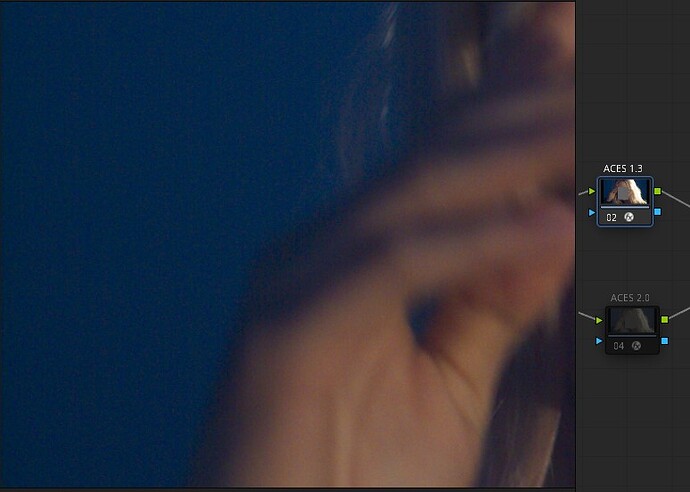
Results of spinning the Gamma and Gain balls seemed as expected, however spinning the Lift ball looked to quickly “break” the image. Note that I am not referring to the intensity Lift but to the RGB Lift. I then looked at this on some gradients and found banding which was also very obvious on the waveform. I then switched on the parametric gamma compression in the Aces transform node (node is ACES 1.3 version) and was able to smooth things out a bit. This might indicate that the compression is not working as well as expected in the candidate ODT.
The issue seems to be located more in the region influenced by RGB Lift and will likely be a problem when grading.
I am mentioning this so those more familiar can check if this is within the ODT or not.
It will be interesting to investigate whether this is an artefact of the LUT implementation, and can therefore be mitigated, or if it is an issue with the DRT itself.
Since the lower bound of the gamut cross section differs substantially from a straight line, and @priikone has pointed out that using a straight line will clip the gamut significantly, I plotted an overlay of “bending” a straight line for the lower part with a simple 1.15 power function (exponent just my “eyeballed” guess) and using a straight line for the upper part.
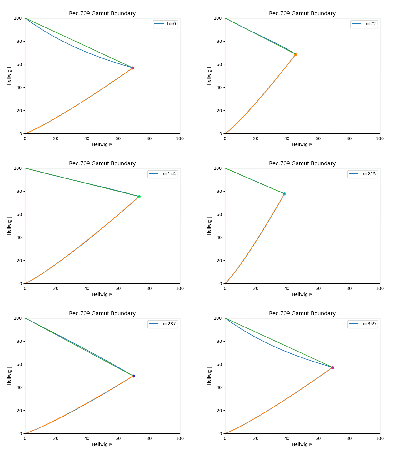
The curve in the lower part seems to approximate the gamut shape well, and the straight line in the upper part is not bad except for the hues around zero.
Since Hellwig JMh is perceptual by design, I’m assuming that the differences visible in the plot are representative of the magnitude of the difference.
(This plot is of JMh as used in v28, with compress mode enabled and the eccentricity still included, so not updated to match Pekka’s latest experiments.)
Here it is without compress mode and with the eccentricity multiplier set to a fixed value of 1.0:
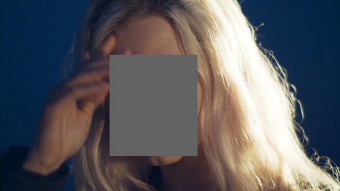
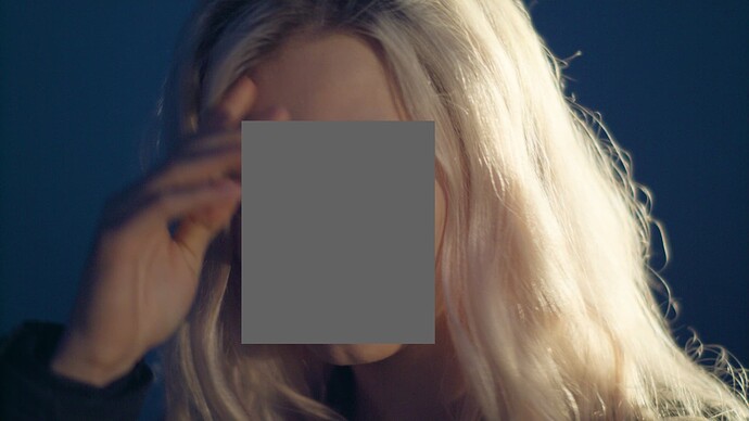
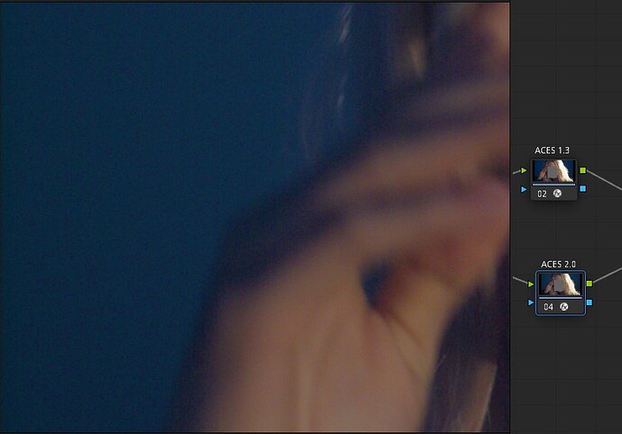
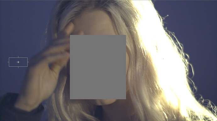
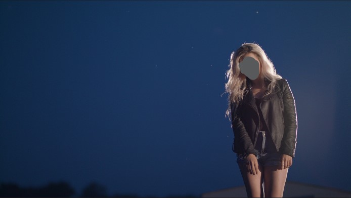
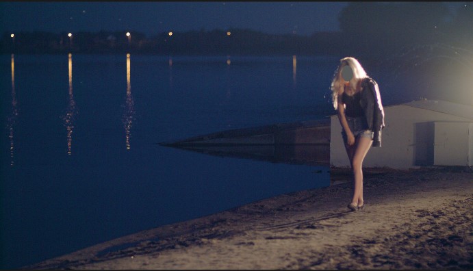
I found all v26, v27 and v28 noisy in darker blue colors. It’s not that noticeable here because of jpeg compression, but in some shots the difference is noticeable enough to switch from using current implementations in the actual projects despite all its pros I like so much.
It feels like there is some hue preserving happening in the shadows, that splits the noise into different hues.
It also has unnatural transition from the hand to the sky. It was shot on URSA Mini 4.6K in the early morning, at 5:00 AM or so, under 2850 Kelvin tungsten light and was white balanced in RAW by eye.
All the examples are with RGC (except for the attached EXR of course).
ACES 1.3:
ACES 2 v28:
ACES 1.3:
ACES 2 v28:
Linear AP0 EXR used in the screenshots above:
Blue_Noise_Linear_AP0.exr
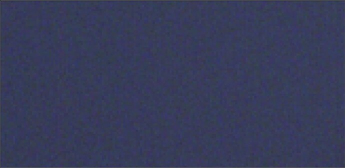
Interesting image, I’m looking at this section of nosie:
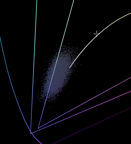
When plotted in Yxy it all sort of clusters around here:
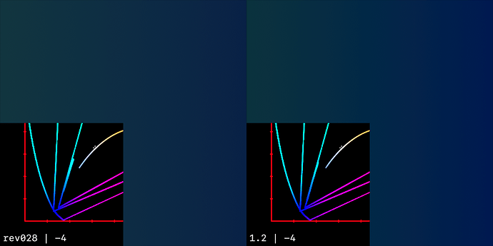
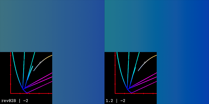
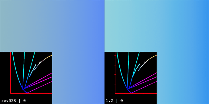
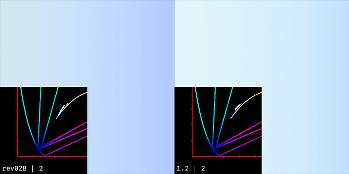
If I make a gradient that covers roughly the same range, it looks like this:
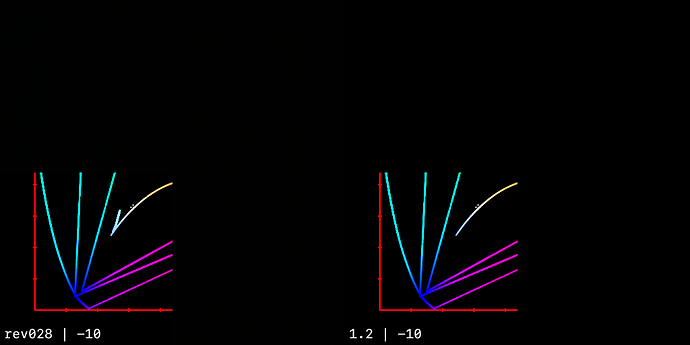
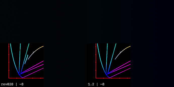
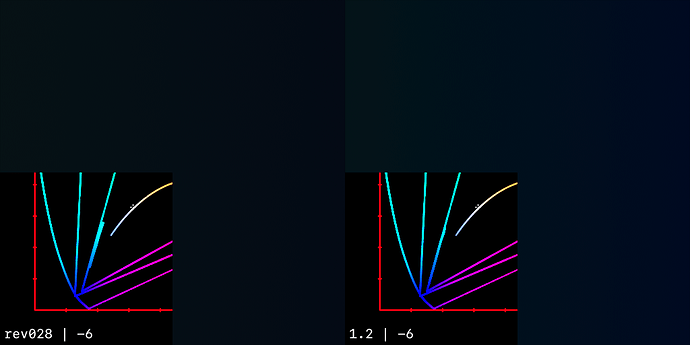
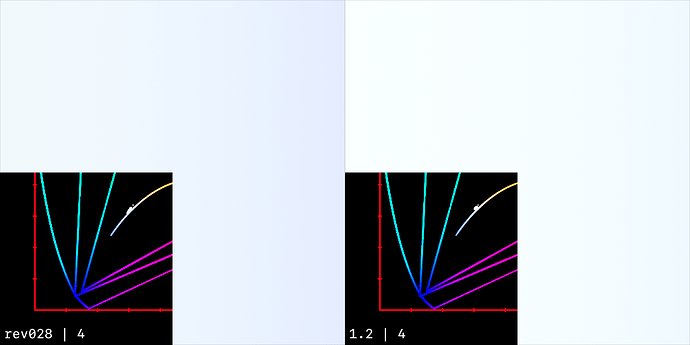
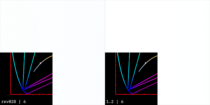
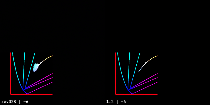
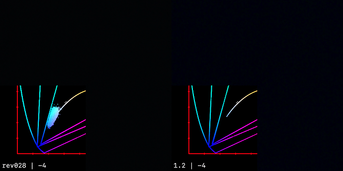
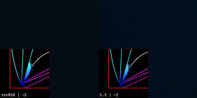
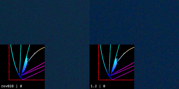
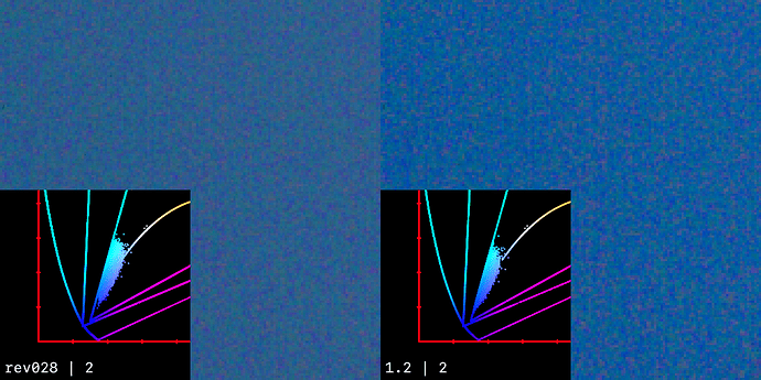
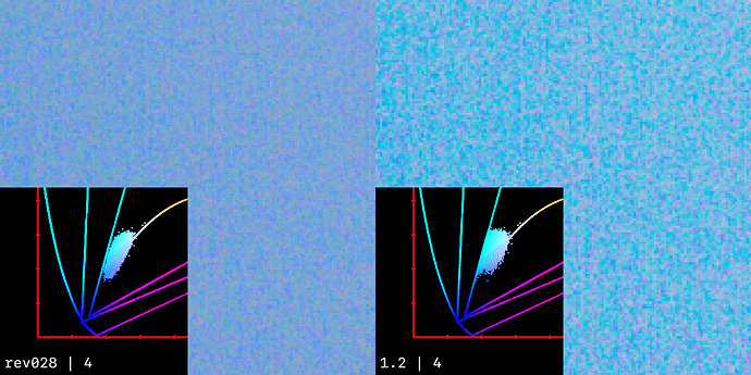
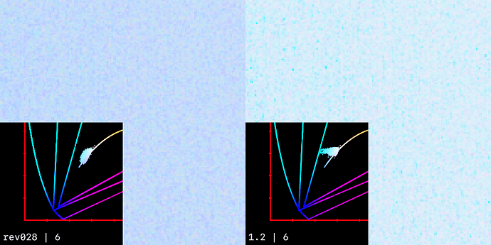
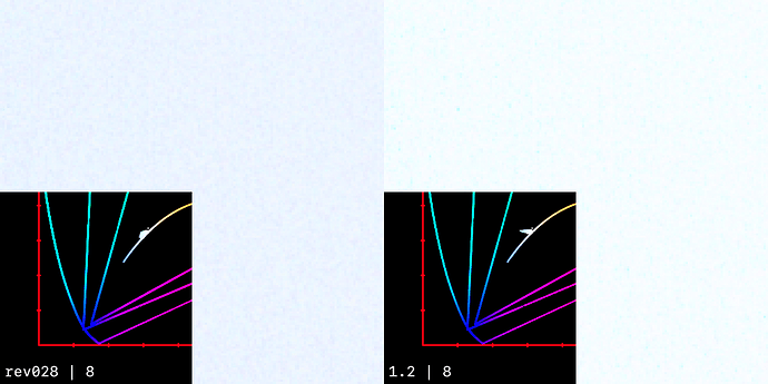
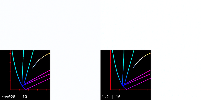
Then with an exposure ramp throught v028 and 1.2:
Here I’m showing a similar exposure ramp on the noise directly:
Wow, looks like a lot of analysis work done here! Thank you for spending so much time on my example. To be honest, I can’t say I understand what conclusions should be made from these plots. Is something wrong with my footage? I can’t remember I’ve seen the same noise increase with footage from another cameras. But for sure I’ve seen examples from a different camera where blue street sign turned into nice filmic cyanish but most likely not accurate blue istead of just dark and saturated clean blue color.
I’ve generated a bunch of images, but I have no real conclusion.
I do find it interesting how much spread the noise causes, for an area that is nominally the same colour (It’s dawn sky right?). The footage isn’t “wrong” per say, it’s real production footage, with real production footage problems.
As always, the question is really, what should be happening?
Looking at the noise patch at it’s normal exposure, I can see why you prefer the rendering through 1.2 at that specific exposure level. But I think when it’s exposed up or down, the v28 rendering is preferable, especually when the overexposure causes hue skews under 1.2.
The RGC doesn’t seem to be a major factor here, as the input values are fully contained inside AP1.
I think it’s a sky, with a very little chance for the water. I was on set and the actress is about 160 cm or shorter, so it looks like for that close up shot the camera was pointed to the sky, not to the water. It was 5:00 AM or maybe a bit later, so there wasn’t completely dark.
Here is a few more images, just for the context. It’s v28 DRT as well.
Here is the comparison of ACES 2 v28 with T-CAM v2, both are DRT for Gamma 2.4 Rec709 display.
I found that if I lower the exposure, I get this blue stroke between magenta and blue-cyan colors with ACES 2, while with T-CAM it’s almost smooth. WIth ACES 1.2 the transition is also smooth, but it’s per-channel, so I thought no need to add it to the comparison.
I’ve added RGC because without it blue-cyan looked more cyan than blue, making the stroke even more visible.
Default exposure => RGC => ACES 2 v28 DRT
Lowered exposure => RGC => ACES 2 v28 DRT
Default exposure => T-CAM v2 DRT
Lowered exposure => T-CAM v2 DRT
upd.
I forgot to add a link to the footage. Will add it in a minute
upd.2
Sorry, I can’t find the link, but it’s this footage. I guess everybody has it.
Filename: ACES_OT_VWG_SampleFrames.0033.exr
Top right corner.
I know, it looks like nitpicking, but it can be way more noticeable even without cropping. If you add blur to this footage to simulate more defocused background, the stroke will be visible even without cropping and zooming.
My hope is that all these dark blue/cyan blue/magenta sharp transitions are reduced once we have the gamut mapping as an approximation with smoothing. There’s many examples in the old ZCAM thread where this is being discussed. Latest CAM DRT is significantly better than the old transfrom but it’s still visible in many images. The lightsaber image is one good example where one can clearly see a sharp line in the background as it transitions from purple to blue/cyan.
From ZCAM thread for example. I think these are pretty much the same issue.
I’ve managed to get my interactive cusp plotting working in a Colab.
It is rather slow compared to running it locally, but at least it means anybody can try it out.
It does not include the SDF approximation @priikone showed in meeting #86. Pekka, feel free to add that if you have time, and feel it is useful.
(Note that as mentioned in my write-up of the meeting, the gamma used in the approximation not matching the Nuke implementation was due to different surround settings. This plot uses a gamma value calculated from the surround parameters – set to “Dim” by default – rather than having a gamma slider like the version shown in the meeting.)
ADDITIONAL NOTE:
To get the plot to run interactively, it seems you need to “Run all” and then possibly “Restart runtime and run all”. I would be grateful if somebody could confirm to me if they can do this successfully.
Can confirm, it runs for me after Restart runtime and run all. (Windows 10, Chrome) Slow indeed, but nice to be able to analyze and play with it.
Nick, Will also confirm on Windows10 and Google Chrome after Runtime/Restart and run all. Thanks.
I still am wondering about the issue at lower brightness/exposure (banding in gradients at lower levels)(the bands/ lines in the neon of frame 0032 above)(and what was shown last meeting in the Nuke 3D example showing the gamut compression. The banding seems to be in the lower exposure region and none or very little to discern in higher levels.
I do understand the precision and why it should be satisfactory (from the Dolby information showing signal above the noise.) Certainly the 10-bit should be plenty. However, I sill cannot be totally comfortable when the issues seem to be occurring in only the lower exposure range.
If the calculations are 10-bit now and there is no need for negative numbers can the calculations be made using 11-bits and see if the results show any less banding. The 11-bits should be doable with half-float and not bring a major change in computation. And if there is no difference between using 10-bit or 11-bit that could further establish the precision as not an issue. I just can’t shake the feeling that moving along the cusp at low exposures may not have enough precision at certain places causing this jump/banding. I hope my feeling is wrong, but then what is causing this?
We talked about this in the meeting, but I’ll try and show what we think is the issue here.
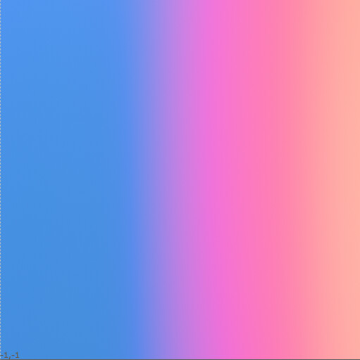
As you point out, at normal exposure, the gradient appears smooth:
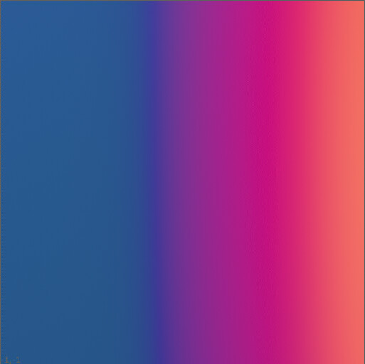
But at 1 stop under, the transition starts for form a V shaped discontinuity in brightness:
If we look at the gradient in Yxy space, we can see there are a mix of in and out of gamut colours, with the cyan drifting outside of the 709 boundry:
Post gamut compressor, we can see those values have been pulled back inside the target gamut. Whilst this does seem for for a bit of a hook shape in 2D, this doesn’t seem to be what’s actually causing the issue:
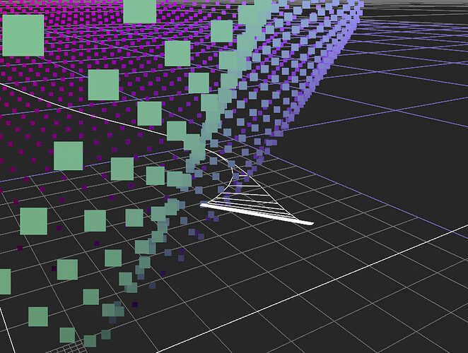
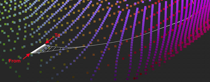
If we look at this 3D visualisation in JMh space, we can see the same values represented a form that represents the pre and post gamut mapped values. Where the white the line is thin, the pre and post gamut mapped values are the same (all in gamut), but where it’s thicker, we can see the connection between the pre and post gamut mapped values.
The out of gamut cyan section is here:
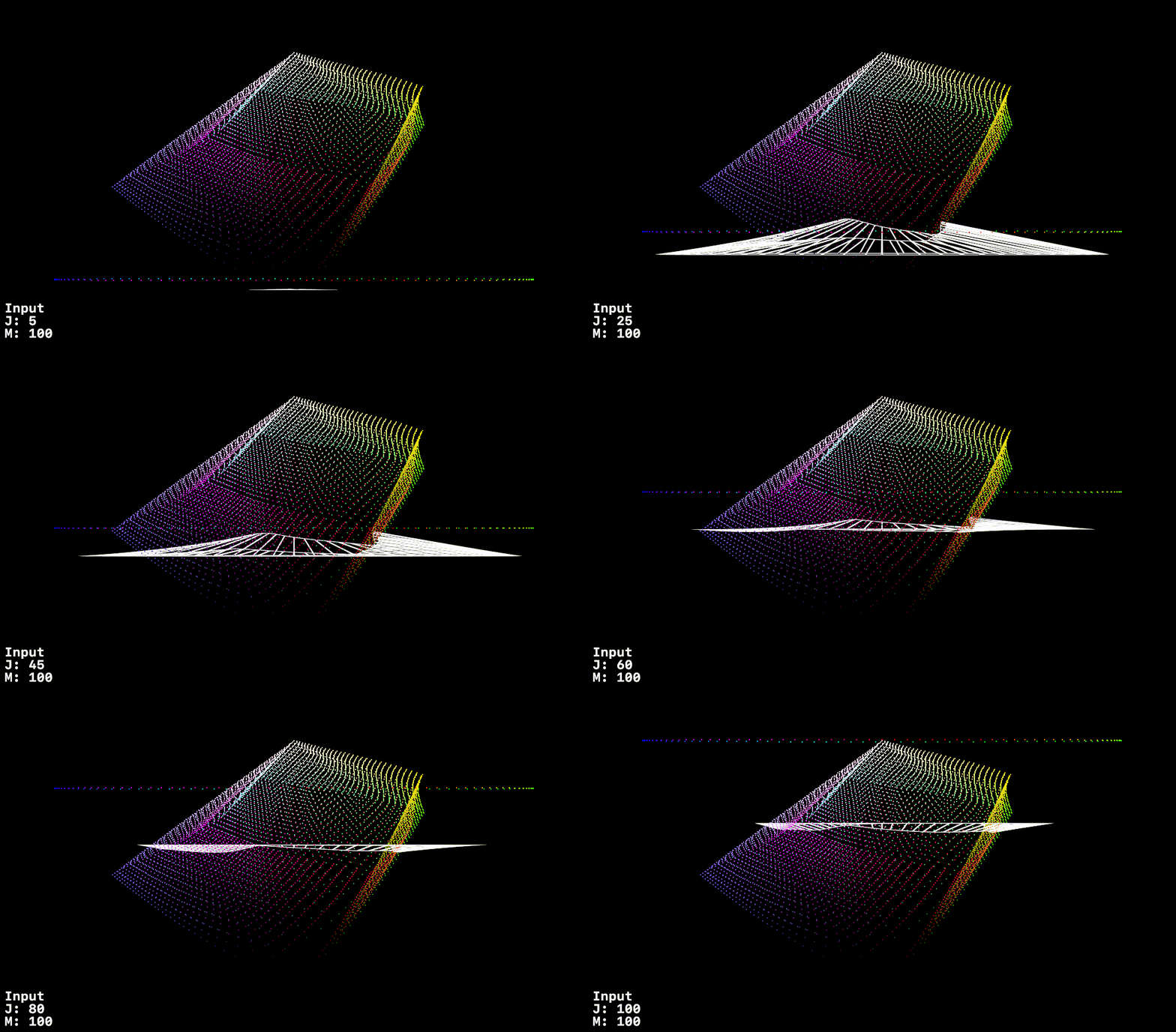
If we look at it directly from the side, the issue becomes clearer.
The further the gamut compressor is pulling the value is, the more it’s boostin the J value, increasing perceptual brightness.
It also explains why the effect is exposure dependant, as the direction of the focus point varies depending on it’s position relative to the gamut cusp.
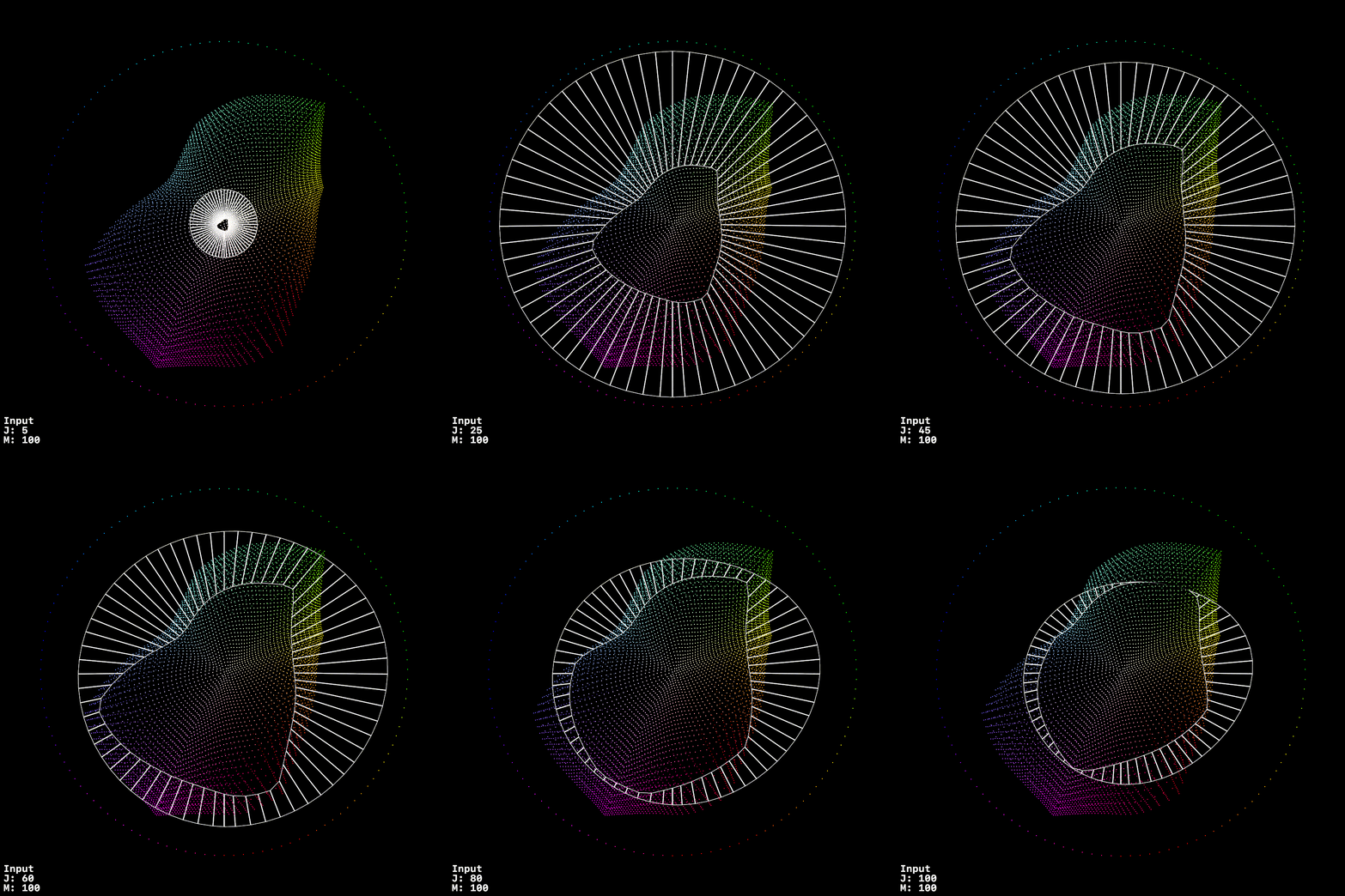
This is sweep, the outer dotted line is input JMh
The outside of the white form is post tonemapped - post chroma compression JMh
And the inside of the white form is post gamut compressor:
The same sweep can be seen from the top here:
My half considered reading of this is we perhaps need to be a bit more conservative with how far we deviate from flat with the gamut compressor J focal point. We know we need some at the extreme top nd bottom of the range, but perhaps we should be steering closer to flat in the middle.
For example, the top half this image is fully focused on the cusp
Whilst the bottom is fully focused on the SSTS midpoint, producing a much flatter projection.
I think there is one additional piece, which is that the compression happens along the perceptual hue line, which skews the color to even more cyan in the chromaticity space, making it also appear brighter (that hook in the 2D diagram). @bottosson explained why this happens, which I think is what’s also going on here.
I guess the claim would be that this is perceptually correct, but it sure doesn’t look correct. We get similar looking image with the current DRT with dark blue/cyan transition, but not so extreme, it’s much better.
We can try to improve this by changing the lightness mapping (J projection) in the gamut mapper. But the perceptual hue lines around blue (perceptually accurate or not) will have big impact as well.
Pekka and Alex as well, thank you for this information especially the OKlab reflections which seem quite illuminating.
Something else comes to mind in that since it seems we have thus far been looking at a rec.709 target, so will this issue of non-smooth/banding become worse as we then move to targets of P3 and rec.2020? Or might those results be better?
Sent pull request for @alexfry for v29, also available in my fork . It brings the following:
-
Replaces the iterative gamut intersection finder with an approximation to rounded and, optionally, smoothened triangle. Currently the cusp smoothing is set to 0, ie. it’s disabled.
-
Removes the eccentricity factor from Hellwig2022 model. Mostly color rendering doesn’t change, except for highly saturated blue and magenta, making them slightly lighter. Custom primaries were adjusted slightly because of this. This change is done to simplify the model.
-
Changes the default viewing conditions to Dim. Rendering changes a bit.
-
Removes the focusDistanceMin and focusDistanceMax introduced in v28 and brings back the old focusDistance with single value, and sets the value to the old 0.5. Rendering changes a bit because of this.
-
Removes the old tonescales.
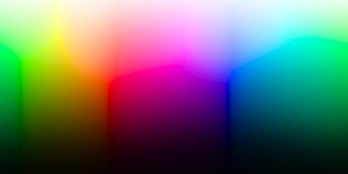
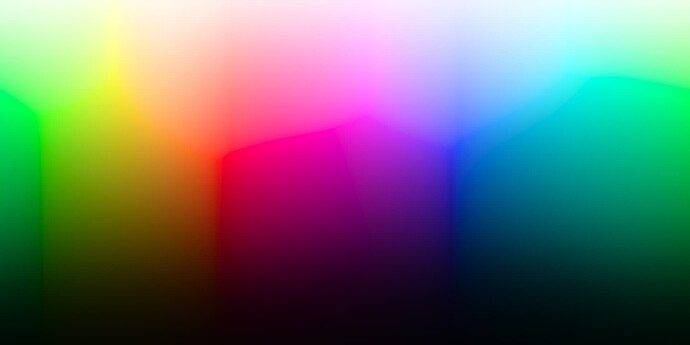
Inverse:
v29 Rec.709 inverse:
v28 Rec.709 inverse:
The new gamut intersection has cusp smoothing but it’s disabled by default. The smoothing tries to avoid reducing the gamut. However, there is a small reduction with some colors that shows up when doing gamma 2.4 inverse, but not so much with linear inverse. Following images compare cusp smoothing set to 1.0 and 0.0, in that order:
So does this mean that the only iteration now happens in the init() function to populate the 360 entry look-up of the cusp position against hue? So the gamut intersection is just approximated using the values in this table?
If so, I can start working on a DCTL implementation that has the table from the Blink init() function pre-calculated, and simply declared as an array in the code. Highly unlikely I will have anything by tomorrow’s meeting though!
